
Spotify Wrapped: Is Graphic Design their Passion?
An exploration of Spotify Wrapped 2021’s strange design choices.
Reading Time: 3 minutes

It’s that time of year again.
Instagram stories are flooded with screenshots of top listened-to artists, frantic texts are sent to friends about being in the “top 0.001 percent of Mitski listeners,” and people either shamefully, or pridefully share their year’s worth of bad music taste and boast about their minutes listened.
That’s right. I’m talking about Spotify Wrapped. The infographics and punchy colors that the streaming platform’s “Year in Review” features are instantly recognizable in today’s social media landscape, where millions look forward to seeing their annual music statistics displayed. Yet this year, Wrapped fell alarmingly flat, both visually and content-wise.
“In a year like 2021, even your music gets a vibe check.”
“While everyone was trying to figure out what NFTs were, you had one song on repeat.”
Vulture asked which out-of-touch executive had written the captions for this year's Wrapped, and listeners couldn’t help but ask the same question. For a company whose branding is heavily reliant on being in touch with today’s youth, their attempts at relatability hilariously failed. On top of these cringe-worthy captions, fans on social media also targeted Spotify’s questionable design choices.
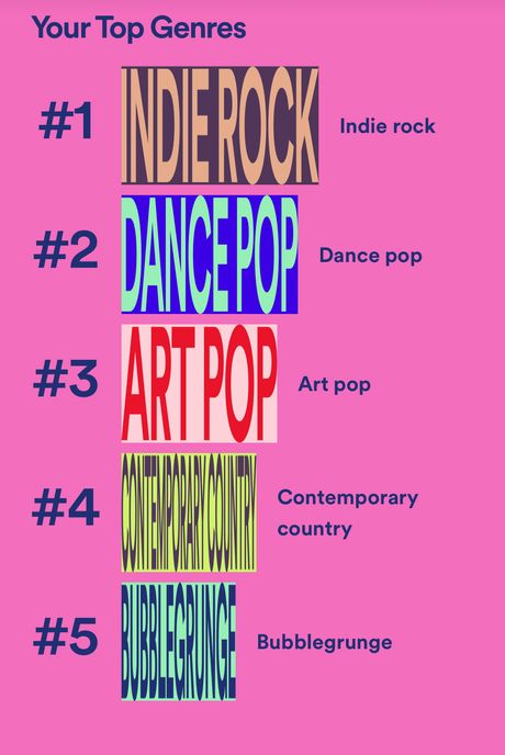
The controversial top genres page inspired a number of tweets that questioned the illegible typography. Each genre was displayed in rows of bar-graph-style rectangles. Hence, the lengthier genres such as contemporary country were impossible to read. Though the titles were written out again in small Sans-Serif font next to the graphic type, audiences complained that the design lacked functionality and felt lazy.
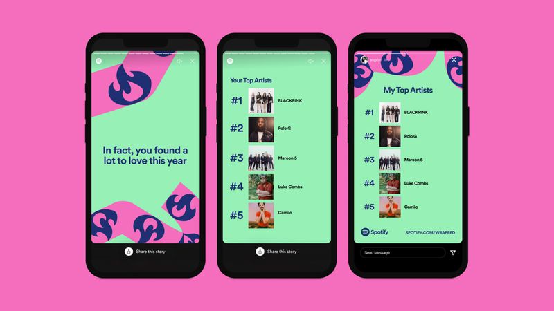
The other notable element of this year’s Wrapped was the dynamic ribbon threading through the slides. “The playful ribbon does a good job at creating unique articulations while tying together the work as a whole,” the global head of brand design, Rasmus Wangelin, said. Still, the simple icons and dull colors were far too basic for many critics, who expected more from a global brand like Spotify.
Yet some graphic designers came to Spotify’s defense. Product designer Inma Bermejo believes the design was “100 percent intentional, and it’s working out the way they intended.” Bermejo, like many others in the design community, sees the bad graphic design as purposeful. This trend of “ugly design” has been around for years, but Spotify uses it as a clever marketing ploy. As users tear into the design, they generate memes, shares, and buzz; getting Spotify exactly what they want: publicity.
It’s no secret that Wrapped is Spotify’s way of boosting engagement and hype with its users. In the end, Wrapped did exactly as intended. The conveniently placed share buttons at the bottom of each slide, similar to Instagram’s story-like aspect, and the bold colors and motifs throughout encourage reposts, screenshots, and shares. This year especially, coupled with the easily memeable content, marked a massive success for Spotify as a company. But does this business strategy excuse lackluster design? As Creative Bolq put it, 2021 Wrapped is a “design nightmare" and the general consensus seems to agree.
However, it's important to consider that design has been shifting toward being intentionally bizarre and ugly for years now. It can be argued that the mastermind behind this year’s Wrapped is trying to push the public perception of graphic design elsewhere. The aesthetic, or lack thereof, of a design is meant to communicate a message. Here, the squished font and ribbon detailing are memorable. It gets pointed out and made fun of. But Spotify’s visual branding leans toward being fun and playful, so doesn’t this fit in? Even the smallest details, such as the awkward splicing of the ribbon, work toward this tongue-in-cheek attitude of redefining graphic type in the public eye as an art form rather than a practicality.
Perhaps this year’s Wrapped was all just a great marketing scheme that everybody fell for: or maybe there was some deeper meaning behind the garish graphic design. Wrapped isn’t built to last lifetimes; it’s meant to last 24 hours on someone’s story before it fades out of existence until another year. In today’s increasingly fast-paced world, content is consumed and thrown out in a matter of seconds. Brands like Spotify are creating content that will be talked about in the short term, and Wrapped is one of the most successful examples.